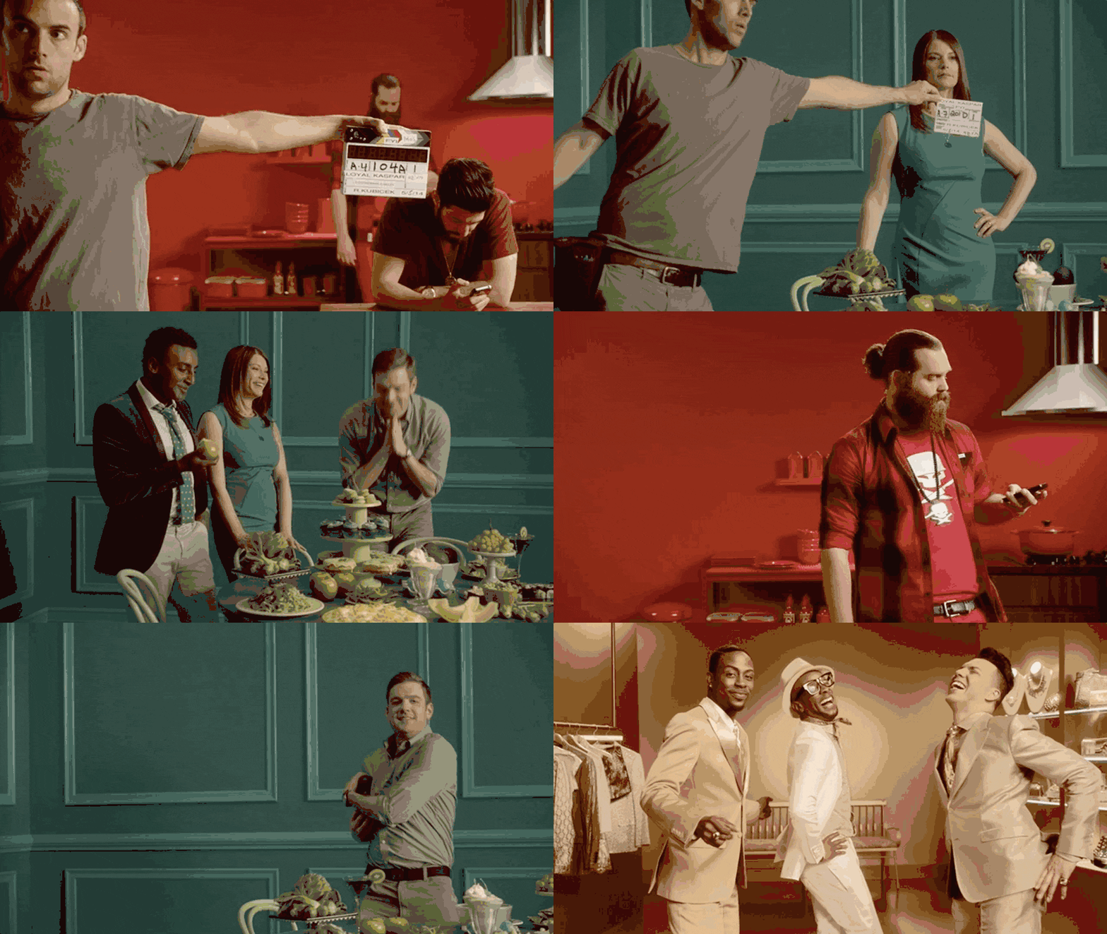
FYI Brand Identity
One of the first big rebrands I worked on at Loyalkaspar and my first experience working on a brand that had photography and cinematography at the center of their identity. FYI was the evolution of BIO network and sought to give a home to a variety of programming about elevating everyday things. Whether that means downsizing your home to 100 square feet to go low impact or cooking piles of bacon just because you can, FYI wanted to create a visual inspiration board in the format of a linear network. Looking back I am still very proud of the work that we did and the brand that we built.
For a much more comprehensive overview of the FYI brand and the process that brought it to life, check out LK's case study.
Credits:
- CD: Daniel Doernmann
- AD: Alexis Aames
- LK Design/Animation Team: Kaz Ishii, Nadia Husein, David Conklin, Braden Wheeler, Erik Van Der Wilden, Rosalina Merrihue
My Role:
My role on FYI was primarily that of 2D animator and colorist. I was responsible for helping with the 2d animation, including the brush write-on type animation style, and the person in charge of the overall color/grade for most of the footage that was shot. I learned a lot on this project, but mostly I was excited to learn more about the typical DIT workflow of handling footage as well as the basics of Divinci Resolve.


